Saturday, 5 November 2016

Cover Love #21

 Welcome back to another week of Cover Love where we feature eight top voted book covers and give our unbiased opinions on it. Wow, I sound like a talk show host. I found some of these covers from bookstagram (I have started one too @zoellareads), the others were selected by Jordan, Inia and Hira. Even as I write, I haven't yet seen the covers, so my comments will be the first things that come to my mind. Since, others are a bit busy today, It looks like it will be just me and you today.
                                          
Image result for vassa in the night


Zoella: This is one of those covers that look prettier as a hardcover than an ebook (The Elite by Kiera Cass is another example. As much as aI love the font and the typography, the background isn't exciting enough. Personally, I'm not a big fan of the white blurred outlines over the buildings.
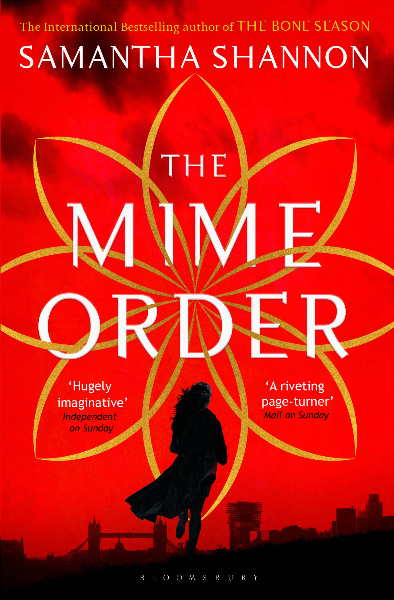

 Image result for mime order

Zoella: I found many different versions of this cover. Most of them featured this symbol on a plain red or textured background. That was when I saw this. The addition of silhouttes has made a world of change. I have heard many saying that they loathe seeing people on covers. But in my case, I love covers with people. It adds a kind of intimacy and comfort that you don't find in other covers. And they look pretty. Which way do you prefer your covers *winks*).


                                                        Image result for tonight the streets are ours

Zoella: This book has been on my Amazon cart for a long time now. I haven't got around to buying it yet. I don't know anything about the book,  the cover looked interesting and I added it to the cart. Well, that's one way to choose books.
This book would've looked very fantasy-ish if not for the baby pink palette and sunburst effect at the top. I love how the words in the title interact with each other and that addition of the little feather under "A Novel." The picture is cliche, but the extra effect and good font treatment is really helping this book stand out.
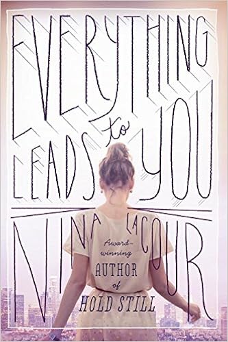
                                                         Image result for nina lacour books

Zoella: I'm in love with this cover.Now, this is how you design a contemporary book cover. The soft colour palette, city n the background to let us know of the setting, the protagonist with face away from us so that we are allowed to imagine her in whichever we want, the amazing font treatment, even the author's name has been included as an organic part of the title and finally the filter like box effect. This is a book I would definitely buy for the cover and not regret it.


Zoella: This cover is umm... weird. The photoshopping of the butterfly onto the apple is good. But this is one of those covers which I will notice but will walk away without a second glance. I'm sorry but I just don't get this cover. Is it about the metamorphosis of a butterfly? Is it about a killer? I get it. It's about a killer butterfly, isn't it?


Zoella: A splash of colour on a monochrome cover works.Every.Single. Time. Maybe I should dedicate one week to exploring just those kinds of covers.I love how they have used a feather to hide her face. This way you can have a face on the cover and be free to imagine the protagonist as you wish.The little flourishes at the boundaries are elegant and do not steal away the focus. See the tagline, see how the numbers are going in descending order. This shows me that it has a prominent love triangle(Which I hate, So won't be trying out this book), is set in two worlds; one probably human and other fantasy and one earth shattering secret. The tagline will do an amazing job of reeling the potential readers into buying the books.


Zoella: I loved this book. If you like college romance you should read this. That said I'm not a huge fan of this cover. Thematically, I really like it. This image really shows how it is to feel trapped, with no way to escape. That probably is the only thing I like about this cover. I would've really loved this cover if it was in a different kind of book. But, it just doesn't match the genre and the story.
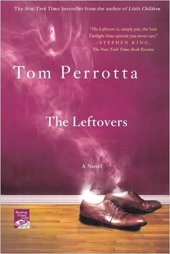
                                                              Image result for tom perrotta the leftovers

Zoella: Now, this is one interesting cover. Smoke coming off from shoes would've made an impact on its own. But by setting it up against a wider background, it gives off the impression that the man owner of the shoes disappeared into a puff of stroke, midstride. See, you can see whole story there( even though my story might be incorrect). This is a cover that intrigues you. I will certainly be reading this book.\

My favourite book this time was Nina Lacour's Everything Leads To You. This probably is the first time I have selected a non-fantasy book. So, which was your favourite? Let me know.
And if you want to nominate a cover to this feature, feel free to so. We will give you credit while posting.


Thursday, 27 October 2016

Cover Love #20

How is your day going? Can't believe it's week 20 already. Without further ado let me unveil the top 8 covers this week and remember if you want to see a cover featured here, you just have to comment the book title down below.


The first is an animated cover. It lookes so cool.

 Inia: This is obviously an e-book cover. Now this is the kind of innovative covers that e-book cover designers can take inspiration from. The mechanical moving heart is such an impressive touch to the already noteworthy cover design. I love the light purple, black and white colour theme. The title font is cliche yet a good kind of cliche. All in all, this is a pretty well-done cover.


Inia: This cover looks kind of bare somehow. I'm all for minimalism but this is bordering on too plain. Other than that, the pop-out effect brought about by the cover art is quite cool and the colour palate with just primary colours is soothing.


Inia: Wow. Such a creepily beautiful cover. I'm drawn in by this cover yet it is giving me the chills. Amazing cover art, gorgeous effects and a haunting aura; I would definitely give this book a try just by judging it by its cover.


 Inia: This screams fantasy novel to me a very unappealing way. I don't really like colour scheme or the artificial look the cover art is exuding.

Inia: Damn, this is a seriously cool cover. So unique as well. I don't think I've ever seen such a cover design before. The butterfly with the pretty, fragile looking top wings and blades for its bottom wings...the symbolisms and the metaphors that are springing to my mind right now are countless. I love the fiercely sharp title font that is perfectly matched with the title meaning.


Inia: I love glittery, shiny things and as subtle as the shimmer in this cover art is, I'm still attracted to it like a magpie to a shiny silver spoon. The gold liquid seeping through the midnight blue walls in the cover art and the captivating title all have me hooked.


Inia: Is this a book on black magic? *shudder* No thanks, anyway. I can't even look at this book cover for long, it's disturbingly horrifying. How did this make it into our cover love session, Zoe?


Inia: Ahh what's with all the creepy covers in this session? This is at least a well-done one. I can imagine people wanting to buy this cover seeing the cover art(though I'm definitely not one of those people). The colour scheme is really nice, I have to say. Working with a dark theme, this book still manages not take on a completely dreary colour palatte.

So, which was your favourite cover?


Thursday, 20 October 2016

Cover Love #19


And we are back again with this weeks's Cover Love. While all of us have pitched with in with the recommendations for this week, you all will get to hear only Jordan's amazing critiqe this time. All the better, I say. I'm awesome at what I do!  


                                              Image result for colleen hoover confess

Jordan: What I like about this cover is that it doesn't follow the usual dark colour theme this genre entails. A very welcome and attractive change. I like the textured background. This cover is simplistically eye-catching. I am interested enough to give this a read.


                                               Image result for take me with you nina

Jordan: At first glance, it seemed like a mermaid. Is that a mermaid? While I'm not a fan of the different fonts for the title or for the byline, that underwater picture gives me the chills.


                                                Image result for melissa marr book

Jordan: Those warm tones of the flower, especially the gold and the pink, clash with the cool tones of the background.  A cover with the potential to be great, this one just missed the mark for me.


                                                  Image result for harley and rose carmen jenner book

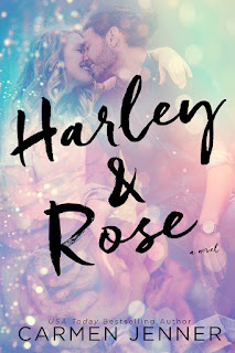
Jordan: I have a special fondness for the combination  of the hues of pink and blue and I do like this one, too. That title font could do with some more, though. A different colour, perhaps?


                                                   Image result for forbidden book

Jordan: That picture gives a whole new meaning to the phrase "guard your heart". I like how uncluttered this cover is. And I suppose this would look really majestic as a hard bound book.


                                                   Image result for the darkest minds


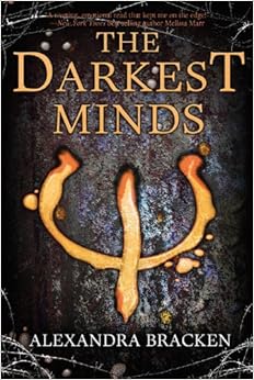
Jordan: Barbed wires are certainly popular this season.  While I don't really get the significance of the trident-like symbol, I appreciate the image all the same. The texture of the background is quite realistic. I like it.


Jordan: I love this quaint cover. That smoking matryoshka doll, and that title! I'm going to get my hands on this book as soon as possible.  


Jordan: I would love to actually hold this book in my hands. Something tells me this one is sure to be a beauty. I love the colours, the images, and that vintage font. And the byline's font is a classic that works every time.


 It's time to choose and I'll go with Anna Blundy's Neat Vodka. It's one of those covers that definitely deserves a second look.


Friday, 14 October 2016

Cover Love #18


Jordan and Inia are back with Cover Love! We know you've missed us, so let's get right to it.


Inia: Hmm. It's a nice cover but I feel like I see similar ones all the time. That heart made from red broken glass pieces is brilliant though.

Jordan: I love the detailing on the unpolished white hardwood planks. And I'm in awe of the way the glass shards have been arranged. Heartbroken at it's best. I truly like this one.


Inia: I didn't know Joey Graceffa wrote books! This is such a cool cover. It's so unique too.. I love the vertical placing of title and the futuristic cover art. Great blend of colours as well; it's striking and it stands out yet there is nothing overpowering about it.

Jordan: While I like the font and the placement of the title, I don't like the cover in its entirety. With its futuristic approach, I feel the image presented could have been better.


 Inia: That's a very beautiful mix of blues on the cover page but somehow this book looks boring? I think it's just that HTML font giving me flashbacks to my very boring 10th grade programming classes. The cover page is quite pretty albeit a bit too plain.

Jordan: While I appreciate blue, this is too much blue for me. The cover doesn't not stand out to me in a good way.

 Inia: I saw the the word 'Crows' in an vintage swirly font and my mind immediately went "Game Of Thrones!!!". I know it is in no way connected to GOT though it does look like it's also a fantasy novel. Look at that silhouette of a castle against the backdrop of the moon and the clouds. I like the subtle details in this one.

Jordan: I like the cover with its amazing font, that 'art-that-changes-with-perspective' thing they have going on here, and are those sparkles I see? Ooh, I like that.


Inia: Those beautiful intricate designs on the wolf has me mesmerized!! This is such a beautiful cover! That gorgeous font and the striking gold-black colour scheme.. everything is absolutely eye-catchy.

Jordan: I swoon whenever I see the perfect balance of delicate intricacy and wholesome simplicity, and this is definitely one of those swoon-worthy situations. The font, the colours, the sheen, and the details are all remarkable. I would love to get a hard copy of this one.


Inia: I smell a mystery brewing. I hope that blonde woman is that little girl's mother and not the Stranger in Town who is luring the child away into that horrifyingly omnious looking forest. Oh, who am I kidding? That's probably exactly what's happening. I love covers that allow me to play guessing games from the cover art and the byline. This one has a very pretty covert art as well. It looks like a painting, all soft shades and a hazy glow. There is a very appealingly mysterious aura around this book that is making me want to read it.

Jordan: I adore the backdrop, but I find that the blonde pair look as though they were badly photoshopped into the picture. I don't like it.


Inia: Aah, the standard Danielle Steel cover. Most of her covers, like this one, are so comforting. It just makes you feel all warm and fuzzy inside. And knowing the story inside will almost always turn out to be good in a raw, emotional way just heightens these feelings.

Jordan: I love the soothing colour palette used here. The image on the cover links beautifully with the title, while the eggs represent a new life. Danielle Steel at her comforting best.


 Inia: Another vintage book!! I love the detailed little roses lining the border and the dainty cover art. This is the type of beautiful books that come into my mind usually when I think of our Cover Love feature. I would buy this book just for the aesthetics alone.

Jordan: I chose this one to feature here, so obviously, I'm charmed by this. Vintage books have that timeless appeal, and whenever I think of curling up into a blanket with a book and a cup of a tea on a cold, rainy day, it is a book like this with yellowed pages and that wonderful, indescribable scent of old parchment that come to my mind.

I'm pretty sure that our favourites this time are quite predictable: Adrian Tchaikovsky's The Wolf and the Tiger and Lewis Carroll's Alice's Adventures in Wonderland.


Thursday, 6 October 2016

Cover Love #17

And it's time for another Cover Love. This is Hira again! I hope you are not getting tired of me...I just love this feature a lot. Also today Inia is gonna be joining me here (bet you missed her sarcasm, huh?) and we are gonna do what we do best-- judge the book by its cover.

Cover Love #17/ Cover Lust

Let's start, shall we?


The Bees by Laline Paull | Cover Love
The Bees by Laline Paull

Hira: Objectively this is a nice enough cover. I can't find much fault with it. The black, yellow and white looks good together. But I don't like it. It doesn't have anything which draws me in. It's too dull, I guess.

 Inia: I love the simple elegance of this cover. Look at the pretty teal floral design meshing beautifully with the black background! Look at that yellow ocher scattered honeycomb! So pretty. And combined with that font, the book has such a pleasant vintage feel to it. I'm in love.


WildWood by Colin Meloy and Carson Ellis | cover love
WildWood by Colin Meloy and Carson Ellis

Hira: Again, this one also looks a bit too dull for me. Maybe the right word is abstract. I can't even make a wild guess about the book's genre and that throws me off, I see the Harry Potter like guy at the top, some animals, a lot of trees. What is going on? This is definitely not something I would spare a second glance to at a bookshop.

Inia: This book doesn't attract me enough to want to read it but I would probably buy it for the aesthetics. It's a complex cover with a lot of elements and the colour palette is such soothing mix of blue, white and soft brown shades. Again this book too has a vintage feel to it and reminds me of my childhood bedtime storybooks. 

The Black Key by Amy Ewing | cover love
The Black Key by Amy Ewing

Hira: You guys know by now that I am not the biggest fan of fantasy. But I freaking love this cover. She looks like an ice princess- cold hearted and mean, a total badass. I love the font, the details in the background...everything. Quite a good cover.

Inia: Meh. Pretty enough, I guess but I have seen a million covers which look similar to this. I need something more that a pretty girl in a frilly gown to attract me to a cover. The colours are quite nice  albeit a bit dull.

Burned Deep by Calista Fox | cover love
Burned Deep by Calista Fox

Hira: The combination of red and black- my kryptonite. No need to elaborate, right. Also, it seems I have a thing for flowers these days. I was browsing covers for this section and I swear every cover I was drawn to had a flower or a heart on it. What does that even mean? 
Anyway, that flower is captivating. Its too gorgeous. I might just read this one for the cover.

Inia: That's one fiery looking flower! It looks amazing against the plain background. I just wish that font had been a swirly, curly one and not this boring comic sans imposter. The fiery flower deserves better. I think if the font had been different, this would have been a really catchy cover.

A Sprig of Blossomed Thorn by Patrice Greenwood |cover love
A Sprig of Blossomed Thorn by Patrice Greenwood

Hira: This has the look of a proper British novel which you actually read out with a proper British accent (Jordan's words, not mine.) You gotta admit that it looks all prim and proper. It's a cozy cover. Something which you will read while sipping your evening tea on the verandah of your Indian-themed mansion.

 Inia: This cover is so...Victorian. Look at the handle of the dainty little teacup that only a pinkie finger would fit through and those tiny little spoons that would probably break in any hands other than a prim and proper Victorian lady's. That perfect little rose completes the setting. The book looks so inviting and I just want to curl up on my bed on a rainy day and read this.


Closed Casket by Agatha Christie | cover love
Closed Casket by Agatha Christie

Hira: Red and black again. God why am I such a sucker for this combo? It's too clique . This is a very simple yet eye catching cover. Look at the detail on the key. I bet it is important. And it's Agatha Christie, so it's obviously a mystery. Also I have always loved the author's font for Christie's novels. So double points.

Inia: Ahh yes the generic Agatha Christie mystery novel  cover. It's intriguing, it gives absolutely nothing away and mystery fans like me are a sucker for these types of cover.

The Coldest Girl in Coldtown by Holly Black | cover love
The Coldest Girl in Coldtown by Holly Black

Hira: I love the name of the book. But I wish it was a more real looking hand. I am not a fan of illustrations. The font of the title is quite cool. But somehow it seems to be young adult...maybe?

Inia: Is it just me or does anybody else see those creepy faces in the background? Please tell me you do. I'm not a fan of this cover either way. 

Ignite Me by Tahereh Mafi | cover love
Ignite Me by Tahereh Mafi

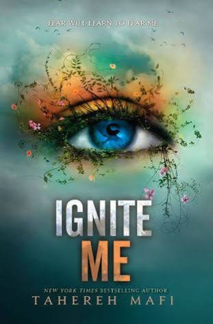
Hira: Pretty! Inia...look at this. We were fawning over pretty pictures of eyes just last night and look what appeared here. Did Zoe read our minds when she picked the covers or what? This cover is just too pretty. The blue iris, and all those colours around it, the lashes shaped to look like flowers...very very interesting and I would say unique. And the title..I love the title. So good. Definitely gonna check this one out.

Inia: Damn! This is gorgeous! I actually gasped when I saw this cover; it is that striking. I agree with everything Hira said about this cover. Definitely gonna check it out.


Hira: My favorite of the week was Ignite Me. Inia what about you?
Inia: Mine is a tie between The Bees and Ignite Me.

That's it for this week's Cover Love, folks! Which was your fav covers? Comment below.


Thursday, 29 September 2016

Cover Love #16 International Version

Hello folks! Did you miss us last week? We are terribly sorry for the small hiatus but we had no other choice. Jordan was seriously sick (send her good vibes, she has been miserable), Inia was running rampant with her exams and work was kicking mine and Zoe's arses. I still can't believe we all survived last week. Personally, I would say all credit to coffee...it saved me from permanent lunacy.

Anyway, we are back and hopefully there will be no more hiatuses anywhere in the near future. And guess what, this week's cover love is special!
IT IS THE INTERNATIONAL COVER WEEK!


Basically, we are going to have covers of books of international authors. Usually the large majority of our book covers are from US Publishers so we decided to switch things up a little bit. And I am so proud to be master brain behind this brilliant idea (I am modest like that). I hope you guys enjoy!


The Immortals of Meluha by Amish Tripathi | Cover Love
The Immortals of Meluha by Amish Tripathi

India

Hira: I should start by saying what a huge success this book was. You think Greek mythology is cool? Wait till you have dabbled into the Indian stories. I seriously became addicted to this stuff after reading this book.
Okay, I should talk about the book cover here. Maybe I will do a book review of this one and fan girl there...tell me if you guys want it.
So, the whole reason I picked the book was the cover. It looked like a fantasy cover but there was something really edgy about this one. The colour palate for one was very very intriguing.  The man with the dreadlocks and numerous scars, the deadly looking trident right behind his spine, the inscriptions at the top...I was captivated by this cover. And let me tell you, this was a book I finished in one go. You just can't put it down.

Zoella: I have nothing much to add to what Hira has said. I like how all the individual elements come together and how everything is centred. This is the kind of cover that captures your attention even in an aisle of overflowing books.

The teleportation Accident by Ned Beauman | Cover Love
The teleportation Accident by Ned Beauman

UK
Hira: Very innovative, isn't it. The cover looks like loose sheets. I loved this one at first glance but for some reason it feels weird after staring at it for a few seconds. Also it's a bit difficult to read the title. I love over all colour usage, the red, the black, the yellow. It's a nice cover which makes my eyes wobbly after a few seconds.

Zoella: Oooh I love the 3-D effect of this cover. The cover looks very classy. Even the font is getting cut by the panels of red. This cover has a lot going on and even though this looks like a book I won't pick up, I am a sucker for this cover.

L.I.E.B.E hoch drei by Vanessa Mansini | Cover love
L.I.E.B.E hoch drei by Vanessa Mansini

GERMAN

Hira: This is not a Hira-ish cover but I feel this is really a Jordan-ish cover. Seriously she might love it. I won't be surprised if it was she who picked this one. The cover idea is cute I guess, but I have never been a fan of Barbie pink. I like how authentic the chalk marks look.

Zoella: I don't think Jordan will like it. She tends to gravitate towards pastel colours. I picked the cover because the cover managed to use a colour stereotyped as feminine and girly into something edgy without losing sexiness. Is Roman ( the name in one of the columns) the hero or something?
I don't like that because it's just written normally while the other graphics looks like it has been drawn with chalk.


The Twisted Citadel by Sara Douglass | cover love
The Twisted Citadel by Sara Douglass

AUSTRALIAN

Hira: Now this is a Zoella Rose cover if there was one. You love this, don't you Zoe?  I personally am very curious about the bubble head like things at the bottom of the cover. It's not rocks...is it helmets? I like the colour palate and the font, but it's too fantasy-ish (I am using a lot of -ish today)

Zoella: LOL. There is so much action going on in the cover, the fairy, the huntsman, the mystic riders. This one looks like an fantasy of epic size. And yes, those are helmets. But one thing I hate about the over is the title font. It's too congested. There should've been more space between the letters.


All that remains by Lauren Dane | cover love
All that remains by Lauren Dane
US

Hira: This one I love. The font, the colour palate, the girl, everything. Also love the tagline...(my inner romantic swoons) The designs at the bottom are a bit out of place but it doesn't bother me much. 

Zoella: This is a really cool cover and I like those two little flourishes on the bottom. I'm not sure whether it's contemporary because the series name suggests otherwise. But, all in all this is a pretty eye-catching cover.

Unwanted by Kristina Ohlsson | cover love
Unwanted by Kristina Ohlsson

SWEDEN

Hira: Very dark. That's the phrase for this cover and I love it! I have this explainable draw towards  creepy, sad books and this feeds my inner masochist. I want to read this. I want to at least check out the blurb. See the blood inside the shoe? I want to know what this book is all about!

Zoella: Add it to your TBR list Hira because I have a feeling you might like this one. For me the most intriguing part about this cover is the white light around the shoe. to me it looks like a puppy. I'm not sure whether it was intended or not, but I like how it adds another layer of smbolism to th cover. And the bllod on the shoes is the right touch to guide the reader as to what genre this is.

The Seventh Child by Erik Vallor | cover love
The Seventh Child by Erik Vallor

DENMARK


Hira: Interesting name and cover. The cradles with each alphabet corresponding to it, very innovative. It intrigues me...which means its a good cover in my eyes. But I am not a fan of the overall style of the cover. It's eye catching but somehow not in a good way.

Zoella: I love solving puzzles and this cover makes me want to solve it. Since, I concentrate mainly fantasy I don't come across many covers that play with the title like this. It's a refresshing change. This looks like a dark and intriging story. I m going to read this.

Throne of the crescent moon by Saladin Ahmed | cover love
Throne of the crescent moon by Saladin Ahmed

Author is Arab-American

Hira: It's a childish cover and I have never been into illustrations. So I am not gonna say much here, since I can't find anything to say.

Zoella: I love this cover. Everything from the font, colours, the burning skeleton, the crescent moon to the fog hidden palaces. This one looks epic.I love the long haired guy, he looks crazy scary. I'm fangirling over this cover so much now. But, one thing I would wih to change is the old wizard because he is the current focal point of the cover. I want it to the fighters. But, other than that no complaints

Hira: My favorites this week have to be The Immortals of Meluha and Unwanted. 

Zoella: For me, it's hands down Throne of the Crescent Moon. 

Which one was your fav cover. Coment below. And has anyone read Magic Binds or Crooked Kingdom yet? I'm going to start on Crooked Kingdom after I finish fangirling over how good Magic Binds was.